Design Diary: Abortion Access Infographic
This project began as an infographic accompanying an article at The 19th entitled “What abortion restrictions look like in every state – right now”.
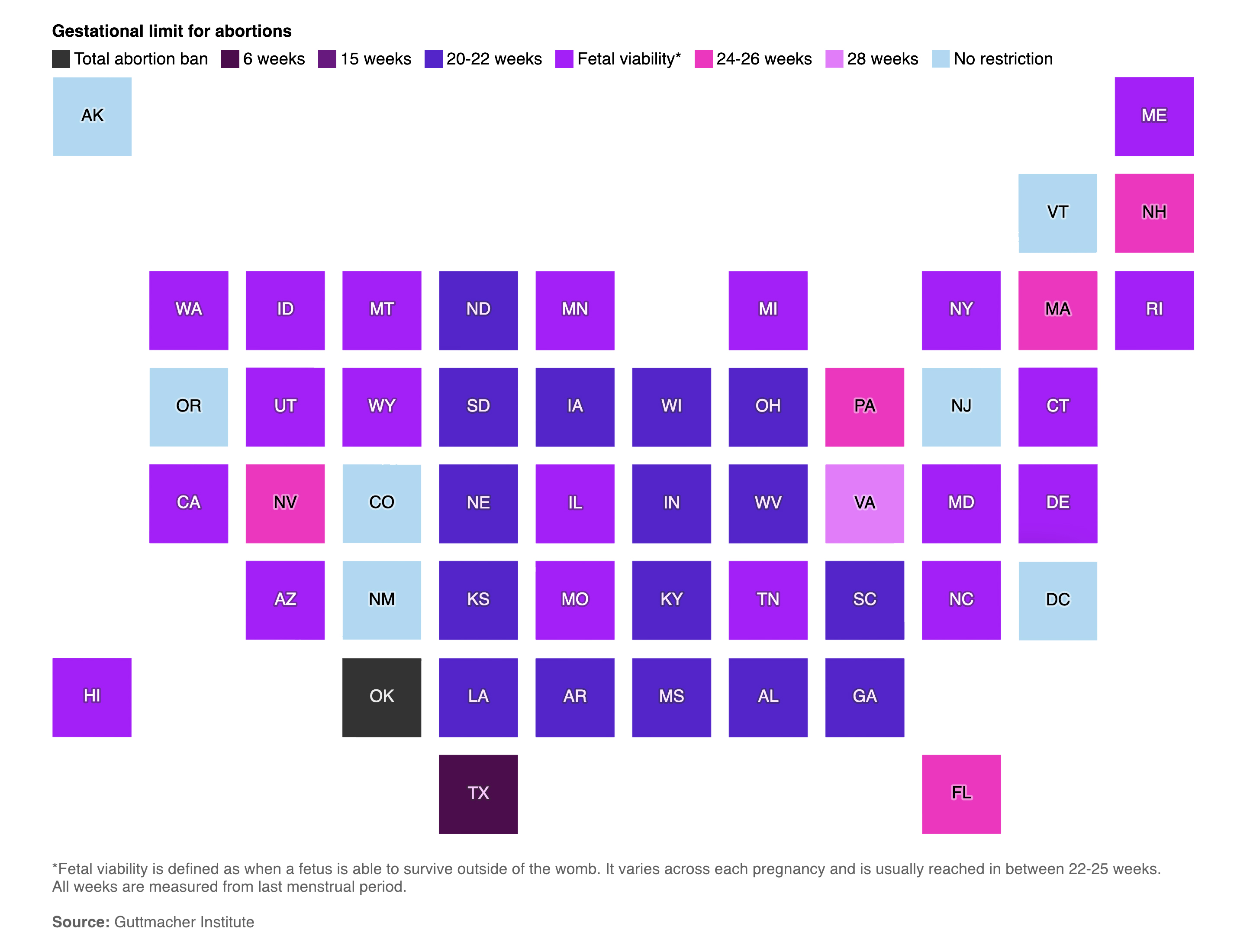
This image, while visually attractive, has many problems that negatively impact a reader’s ability to interpret the information it contains:
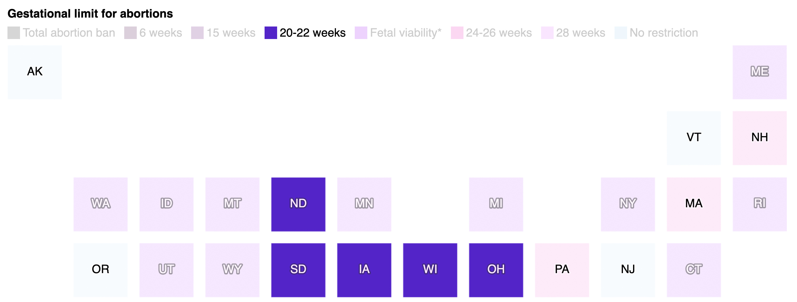
- a distracting grid illusion wherever squares’ corners meet
- a color scheme that is difficult interpret as a scale of restrictiveness
- a stage on the eight-stage scale that is unrepresented in the graphic
- state abbreviations that are unnecessarily small and which appear inconsistently when displaying only one category
- an unnecessary and confusing attempt to depict data as a map
Along with all these ill-considered approaches to displaying the information , and even more problematic, I have learned from abortion-rights activists that the source for the data is also dubious, necessitating a total overhaul.
